01
Two audiences, one homepage
Most agency sites pick one and lose the other. The split has to happen fast, in the first screen, without making anyone feel like they are in the wrong place.
Website design
A recruitment site is really two sites wearing one jacket. Clients want proof you can fill the role. Candidates want to know the jobs are real and the process is not a black hole.
What gets in the way
01
Most agency sites pick one and lose the other. The split has to happen fast, in the first screen, without making anyone feel like they are in the wrong place.
02
Trusted, extensive network, consultative approach. If you place chefs, say you place chefs, and say how many and how fast.
03
Ghost jobs and no reply have made candidates cynical. Publishing what actually happens after they apply, and by when, is the difference.
One we built
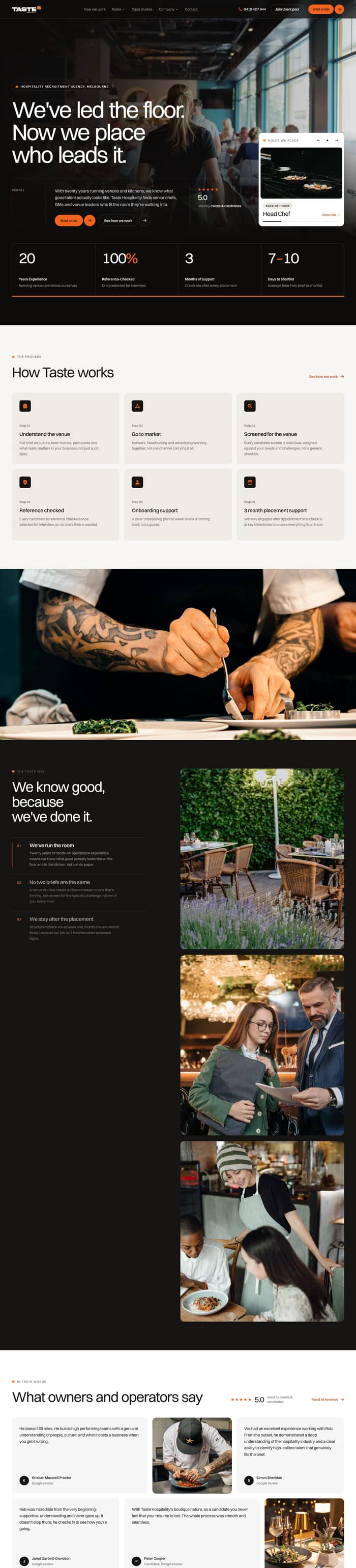 A site we built for a hospitality recruiter, split cleanly between venues briefing a role and chefs looking for one, with the process spelled out on both sides.
More of the work.
Every site in the portfolio is live, custom coded and built the same way as yours would be.
See all the workAdvanced is the usual fit: calm and credible, with a clear path for each audience and no wasted motion.
Questions
We link to whatever job board or ATS you already run. We do not build a job board, because you almost certainly already pay for one.
They can send one through the enquiry form. We do not build candidate logins or portals, since that belongs in your ATS.
Clients pay, so they usually lead, but the split has to be obvious immediately. We work that out at the brief rather than guessing.
Tell us what the site has to do and we'll be in touch the same day or the next.